Most businesses in the UAE are not afraid of the work they need to do. They are afraid of missing something. One overlooked renewal, one misplaced document, one deadline that slips through the cracks — and the consequences can be stressful, expensive, and disruptive.
When we began shaping the DocuBay MVP, this anxiety was the real problem we were trying to solve.
The founder's own experience reflected what we heard across SMEs, HR teams, operations managers, and PRO consultants: legal and compliance work wasn't failing because people were careless. It was failing because the ecosystem around them was fragmented. Documents lived in inboxes and chats. Reminders lived in people's heads. Tasks lived across different government portals. And nothing connected.
DocuBay wasn't meant to "digitize paperwork." It was meant to give businesses peace of mind.
Understanding the Real Problem
Through interviews, workflow mapping, and observing how teams actually manage compliance tasks, a simple truth emerged: people weren't looking for a complex platform — they were looking for direction. They wanted clarity, not more features; predictability, not more checklists. Their emotional experience mattered just as much as the operational one.
Three themes became central to the design approach:
- Workflows needed to be simple enough to reduce cognitive load.
- The system needed to guide users, not burden them with decisions.
- Every interaction needed to reinforce trust and reassure the user that they were in control.
This clarity shaped every design decision that followed.
Designing an MVP That Feels Calm, Clear, and Safe
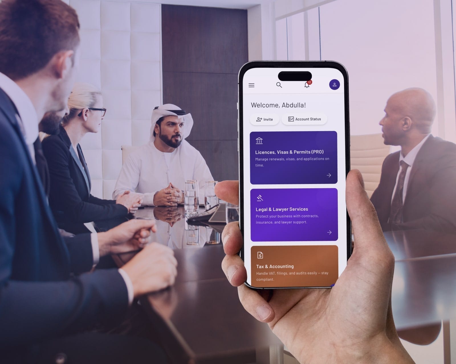
From day one, DocuBay's MVP had to behave like a stable workspace — not a prototype experimenting with users' time and trust. We built the experience around the feeling of moving through a guided process rather than juggling scattered tasks. Screens were stripped of noise. Labels were rewritten in language that felt human, not procedural. Every flow was designed to ensure the user always knew what was happening, what was required next, and what had been completed.
We also treated trust as a design requirement, not a technical one. Permission controls, document states, activity logs, and confirmations were presented in a straightforward, transparent way so users could instinctively understand how their data was handled and who had access to what. The goal wasn't to impress users with complexity — it was to earn their confidence through clarity.
Three principles shaped the overall experience:
- Make every action predictable.
- Reduce ambiguity wherever it appears.
- Design for reassurance at every touchpoint.
By simplifying both the UI and the emotional journey, the MVP became something users could adopt immediately without training or hesitation.
The Impact
When the MVP was introduced to early adopters, something important happened: users didn't comment on "features." They commented on how relieved they felt. For the first time, their legal and compliance tasks lived in one place, with one voice, and one clear structure. This emotional shift — from uncertainty to control — became the core measure of success.
The MVP delivered meaningful outcomes:
- Reduced confusion around document handling and upcoming renewals.
- A calmer, more organised workspace for admins and business owners.
- A scalable foundation ready for future services, integrations, and automation.
Document chaos turned into document clarity, and compliance stopped feeling like a looming risk.
Why This Matters
In legal and compliance work, software isn't judged by how much it can do — but by how confidently it helps someone move forward. DocuBay's MVP showed that great CX isn't about adding layers of functionality; it's about removing friction, anxiety, and guesswork.
When you design with empathy, even the most stressful tasks become manageable, understandable, and ultimately empowering.
This is what meaningful transformation looks like — and this is the standard Sygneo brings to every product we help shape.